Case Study: How I Increased Email Signups 372% with Thrive Leads and the 80/20 ‘Peel and Stick’ Technique
Lately I’ve been on a tear to boost the number of email signups we get at Simple Programmer.
This all started about a month ago. I was feeling pretty frustrated with the slow pace of our email list growth at Simple Programmer.
Most of our signups come from this full-screen popup:

When I joined Simple Programmer in January, I had chuckled at that popup, because it seemed pretty weak to me. The conversion rate averages an anemic 1%.
I was sure I could destroy it with a few split tests.
Not so fast, Mr. Hotshot Copywriter.
I tried crafting new headlines. I tried switching up the design.
But no matter what I tested against this thing, the results always came out a statistical tie.
Definitely an ego bruiser. I was starting to feel like a mediocre 1% was the best I could hope for.
Not wanting to admit defeat, I blocked off a few hours to do some strategerizing and number crunching.
And That’s When I Made An Interesting Discovery
The tool I use for email capture on Simple Programmer is called Thrive Leads.
As a former programmer, I’m a total data geek—and Thrive has some of the best reporting I’ve seen in any list building tool.
One of my favorite reports is called the Content Marketing Report.
This report shows you all of the pages on your website and lets you sort them different ways—by conversion rate, number of signups, etc.
Well I sorted by “impressions,” or the number of unique visitors we get on each page.
And one stat just leaped off the page at me:
If you took out the home page, the rest of our site converted at a pathetic 0.31%!
I Realized I’d Been Fighting The Wrong Battle Entirely
Here I was struggling to get a popup to convert at better than 1%.
But in reality, we didn’t have a popup that converted at 1%.
What we had was a popup that converted at 4% on the home page, and a sickly 0.31% on hundreds of other pages across the site.
Now I was getting somewhere, and I knew just what to do, because I recognized this pattern from my early training in Google AdWords.
80/20 and the “Peel and Stick” Technique
AdWords guru Perry Marshall is a huge proponent of the 80/20 principle, which he considers to be one of the most critical concepts in marketing and business. (His book on the topic, 80/20 Sales and Marketing, is a must-read for every marketer and entrepreneur.)
What Perry found is this:
When you’re buying clicks on AdWords, 80% of the customers will come from 20% of the keywords you bid on.
And among those top 20% of keywords, there are probably 3-5 that drive 50-60% of your total business.
Those 3-5 keywords deserve special treatment, because every little bit of juice you squeeze out of them can have a major impact on your sales.
Make sense so far?
“Peel and Stick” is Perry’s technique for improving the results of those top keywords.
You single them out and test custom ads and landing pages JUST for those keywords.
By hyper-focusing your message to those high-traffic keywords and doing some testing, it’s often possible to grow your business 2X, 4X or even 16X.
What I Was Seeing In Thrive’s Content Marketing Report Was The Same 80/20 Pattern
The vast majority of our subscribers came from ONE page, the home page, and the other pages were woefully under-performing.
The real problem here is that I was treating all of the pages on our site the same.
I was showing the same popup to everyone, regardless of what their interests were.
But What If I Could Customize The Popup To Better Match The Content Of Any Given Page?
And that’s when I remembered about Thrive’s “lead group” feature.
Lead groups are basically just sets of signup forms that share a common set of filtering rules. These rules determine where on your site the forms show up.

That meant I could create a lead group that would only show forms on ONE specific page—and I could create a popup that offers a content upgrade specifically targeted for that post.
Now creating a new lead group is time consuming—I can’t possibly do that for every page on the site.
But I CAN do it for our home page and the top 10 blog posts, and that will account for 60-80% of the traffic we’re getting.
I did some quick back of the envelope math and estimated that I could generate an extra 63 leads per month if I could increase the optin rate on each of these top 10 posts from an average of 0.31% to 2.5%.
That’s an extra 22,922 signups per year!
Time to get to work.
Here’s what I did next…
Step 1: Create the Lead Group
In Thrive, this takes all of 30 seconds.
From the Thrive Leads dashboard, you click the Add New button in the Lead Groups section.
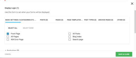
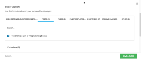
Then you click the gear icon to open the Display Settings, and add a show rule for the page you’re targeting:

The post I’m targeting here is The Ultimate List of Programming Books, and it’s an evergreen favorite with our readers.
Despite the huge volume of traffic, the post was producing just 1 new subscriber per day on average.
Step 2: Create a Relevant Content Upgrade
When it comes to converting organic visitors to subscribers, the best approach is often to offer them more of what they came for.
That’s where content upgrades shine. The basic idea is you offer a lead magnet that somehow relates directly to the content of the post—could be a tool like a spreadsheet, or a checklist, or a deep-dive video.
In this case I created a PDF with a top 10 list of good books.
Step 3: Create Targeted Signup Forms
For content upgrades like this, I find a straightforward “download the PDF” offer performs well:

Between creating the lead magnet and customizing the forms, the entire process took about 3-4 hours.
Then I flipped the switch and turned on the new forms.
So What Were The Results?
Immediately the signup rate on this The Ultimate List of Programming Books post jumped by 372%.
(And this number actually understates the improvement. I’ve been running a split test to see whether showing the form immediately converts better than waiting for 5 seconds, and the loser cut the number of signups by nearly 30%.)
Now instead of getting just 1 signup per day, we’re averaging more than 4 new subscribers every day from this one post—that’s an extra 1,496 new subscribers per year, with a total investment of less than 4 hours.
So far I’ve rolled this out to 3 more of our top posts, and in each case the conversion rates have improved by 100% or more—results that will only improve as I test new lead magnets and fine tune the signup forms.
The big takeaway here is:
The Pages On Your Website Are NOT All Created Equal—So Stop Treating Them Like They Are!
Figure out what the top 10 pages are on your site.
Then use “Peel and Stick” to laser-target your message and offers to those visitors…
And instead of scratching your head while your signups stay stuck in the mud, you’ll be collecting FAR more emails—and making more sales.